HOME -> POSITIVE HEALTH NETWORK
Positive Health Network

TL;DR
Redesigning the Positive Health Network’s website to implement new brand guidelines and help their users learn more about their services and information about HIV/AIDS.
Client Goals
The Positive Health Network was going through a major rebrand– a new logo, new fonts, new colours, and a new website. They had concerns about their previous site and wanted to fix them before entering a new era for their organization.

UX Audit
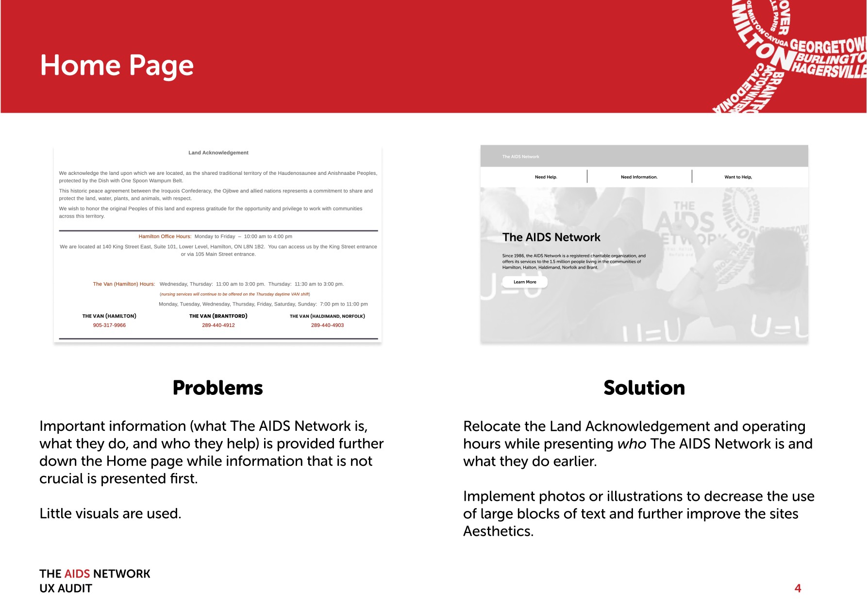
Conducting a UX audit, the main issues I found were 1) the website's confusing structure and how its information was organized, 2) inconsistencies across pages (of not only information, but also styling), and 3) a heavy reliance on large blocks of text, which made it difficult to read.

Wireframes
After reporting back, the Positive Health Network wanted to see how these changes might be represented. I created wireframes of several pages— the most drastic changes were to the sites information architecture and the navigation.


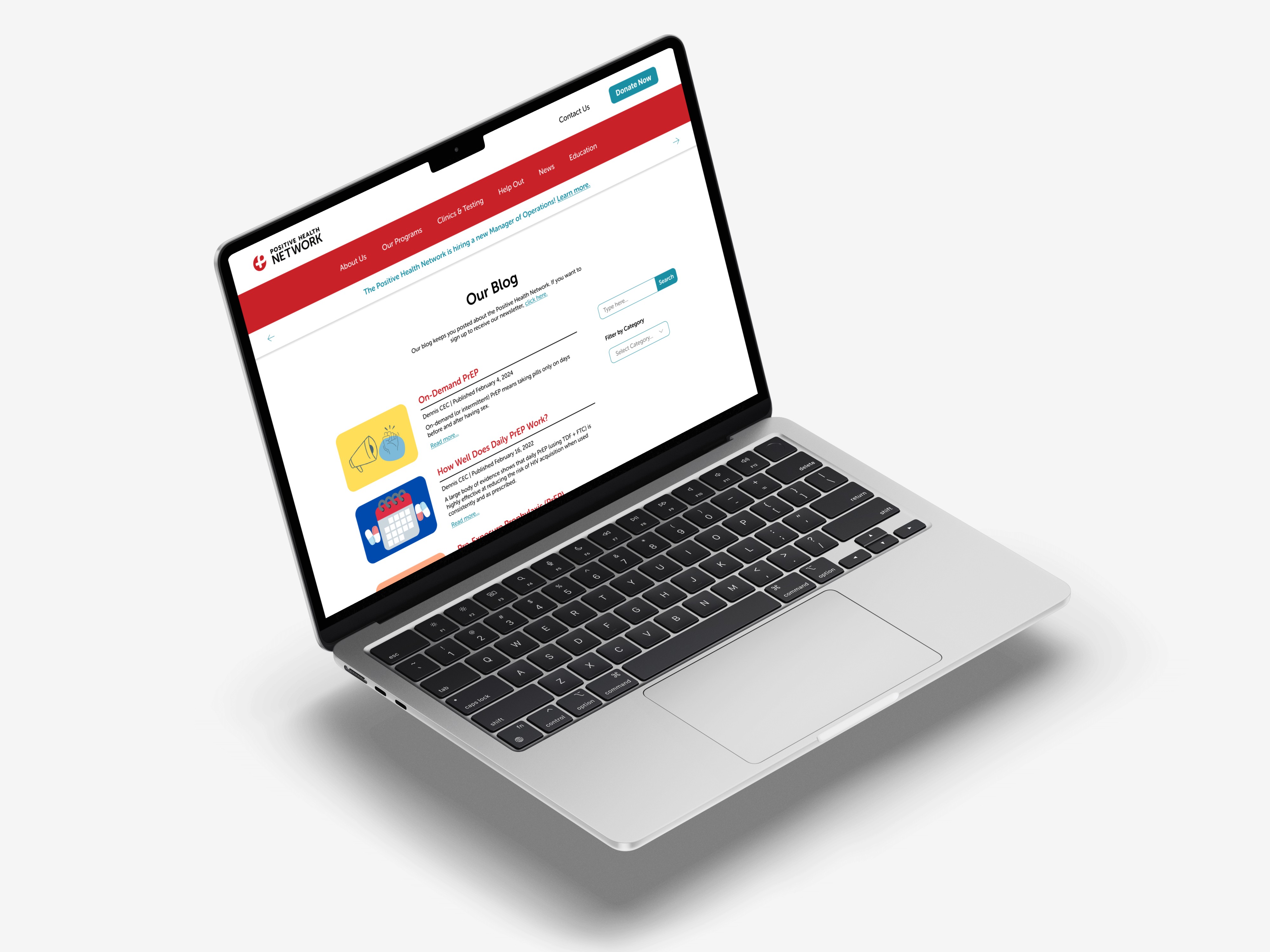
Mockups
Making the Site
Although this wasn’t the first time I had created a website, it was my first time using WordPress and Bootstrap which took me a minute (or two) to get the hang of.
However, I had great teachers and mentors at The Dunham Group who led me in the right direction and helped when needed and would have never been possible without their guidance.
Additionally, this was the first time I had worked as a designer with a team of developers, which opened my eyes to how design choices are implemented, and that as a designer, you need to think about more than just how it looks and feels, but also how realistic it is.

Takeaways
Working with a team of developers is very different than working with a team of only designers— there's a lot more thought put into how a project is going to be made rather than just how it looks and feels.
Effective client communication is key (shoutout to Tim and Dennis from the PHN, who were incredible to work with)!


Like my work, boardgames
or TTRPGS?


